The Texas Tribune
Transforming Texas' top non-profit news site to elevate readability, grow readership, and boost revenue.
Date
2016-2017
Location
Austin
Role
Product Designer
Scope
UI/UX, Web Design
Background
In late 2016, The Texas Tribune led statewide political nonpartisan news with a thriving nonprofit membership model. However, their website was woefully behind the times. The Engineering and Design teams collaborated closely on a complete overhaul to bring the Tribune fully into the responsive age.
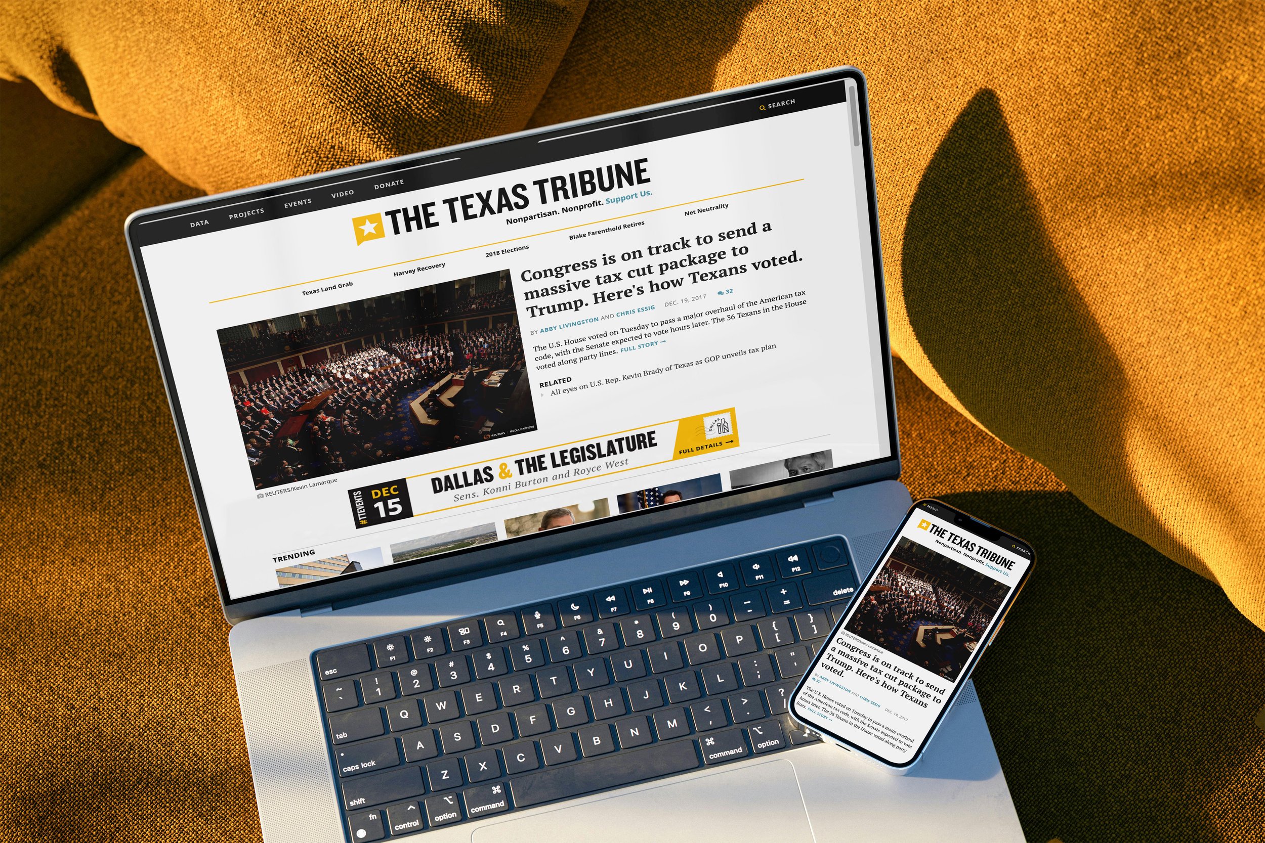
The result? A faster, more visually consistent, fully responsive, more enjoyable reading experience that repaired important features like site search, optimized navigation and membership donations for readers, while simplifying readership tracking and page building for the team.
As the Tribune’s in-house senior visual designer, I eagerly transitioned to the role of product designer, co-leading this project alongside a project manager. During this process, I owned content strategy and layout, wireframing, prototyping, UI and interaction design, while establishing an updated style guide as changes solidified. This move also shifted the culture around site updates at the Tribune, enabling continuous updates through a new, evolving design system.
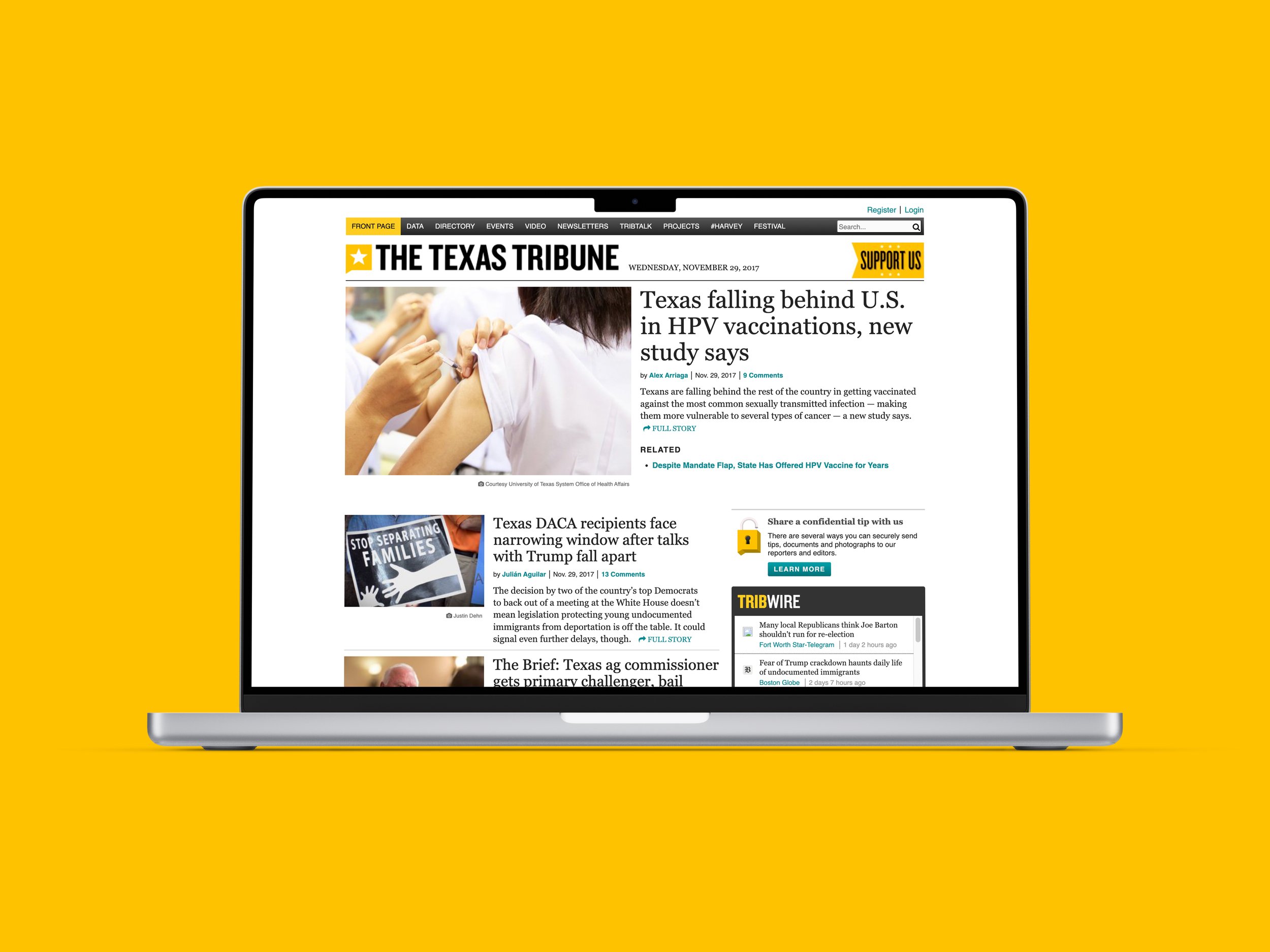
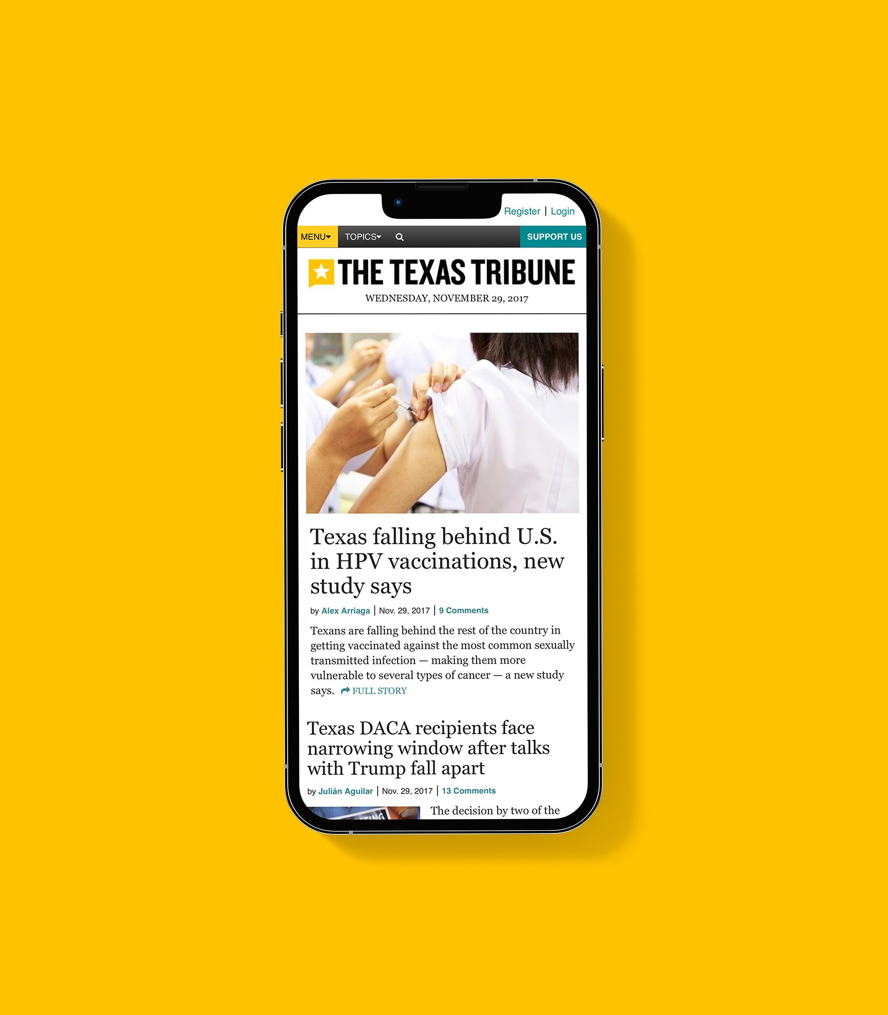
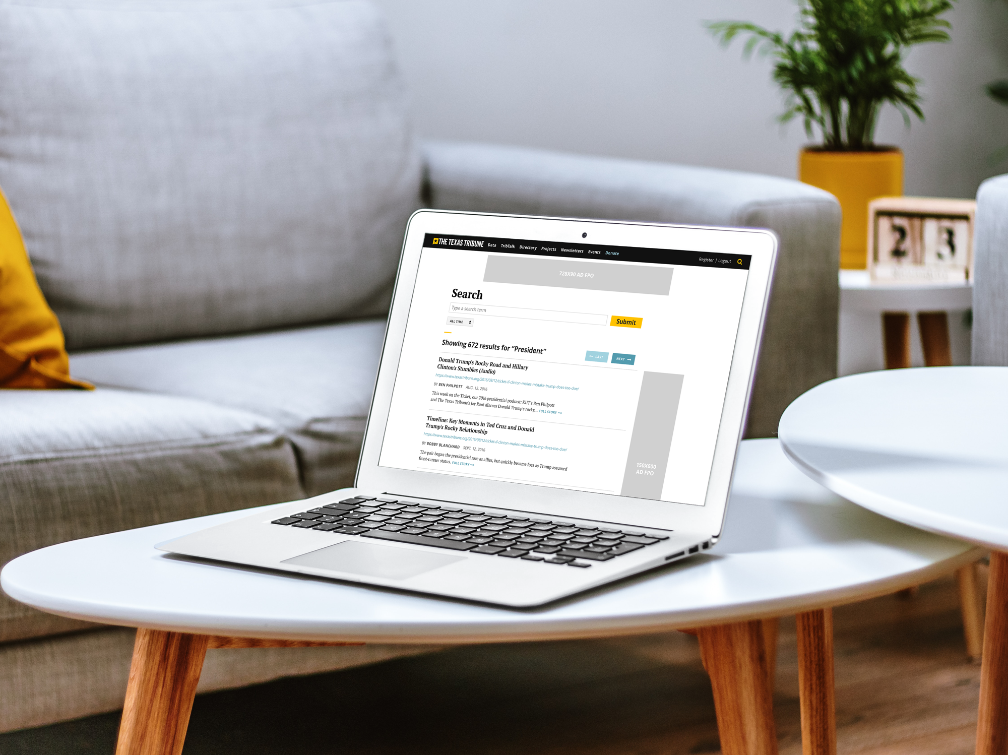
The Texas Tribune website prior to the update
Objective & Approach
The team’s primary goals were to increase engagement and create a more enjoyable experience for our readership while fostering a positive association with The Texas Tribune. This project took just over a year and was broken up into several phases. We committed to using an iterative design process that took on the following pattern:
Sketch and/or Wireframe
Mockup (High fidelity)
Code (Highest fidelity—in context and interactive)
Seek stakeholder input & feedback
Repeat

Initial Research & Tone
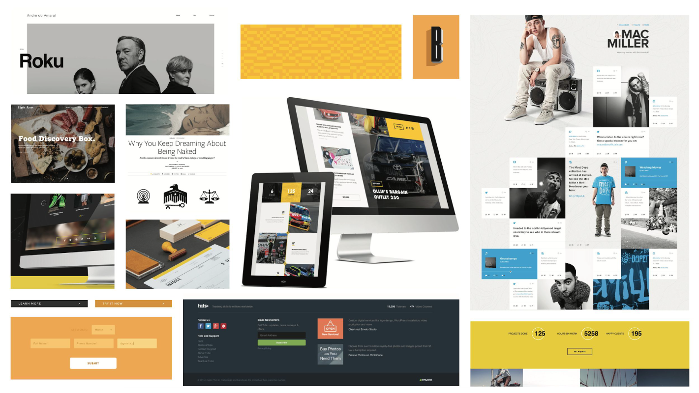
I began by conducting visual research, creating mood boards to spark ideas and guide the redesign. A process that was quickly followed by identifying gaps, updating colors and typography, while consolidating any inconsistencies in the existing website.
During this process, I pointed out that alongside the Tribune’s primary yellow, the secondary teal (used for links) felt too harsh. I replaced it with a shade that better complemented the yellow, eventually leading us toward our updated hover interaction—a more intentional, and animated light blue underline that was less distracting and provided clearer feedback than the default HTML underline.
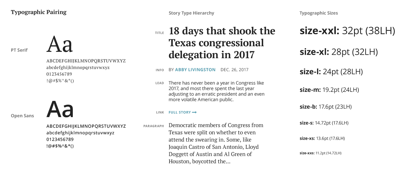
Typographically, the old site relied on system fonts like Georgia and Helvetica Neue. While these ensured proper display, they also constrained the Tribune’s brand, giving it an outdated appearance.
To modernize the look, I worked to identify a new type pairing that would redefine the Tribune’s tone. Any updated typography would have to follow these key criteria:
Accessibility: Pleasant to read, open source (minimizing costs), cross-browser compatibility.
Performance: Limited to two font families, using Web Font Loader for optimization.
Reusability: Versatile for various projects.
Fit: Aligned with the Tribune’s brand and compatible with existing fonts.

The consolidated color palette that would become design tokens
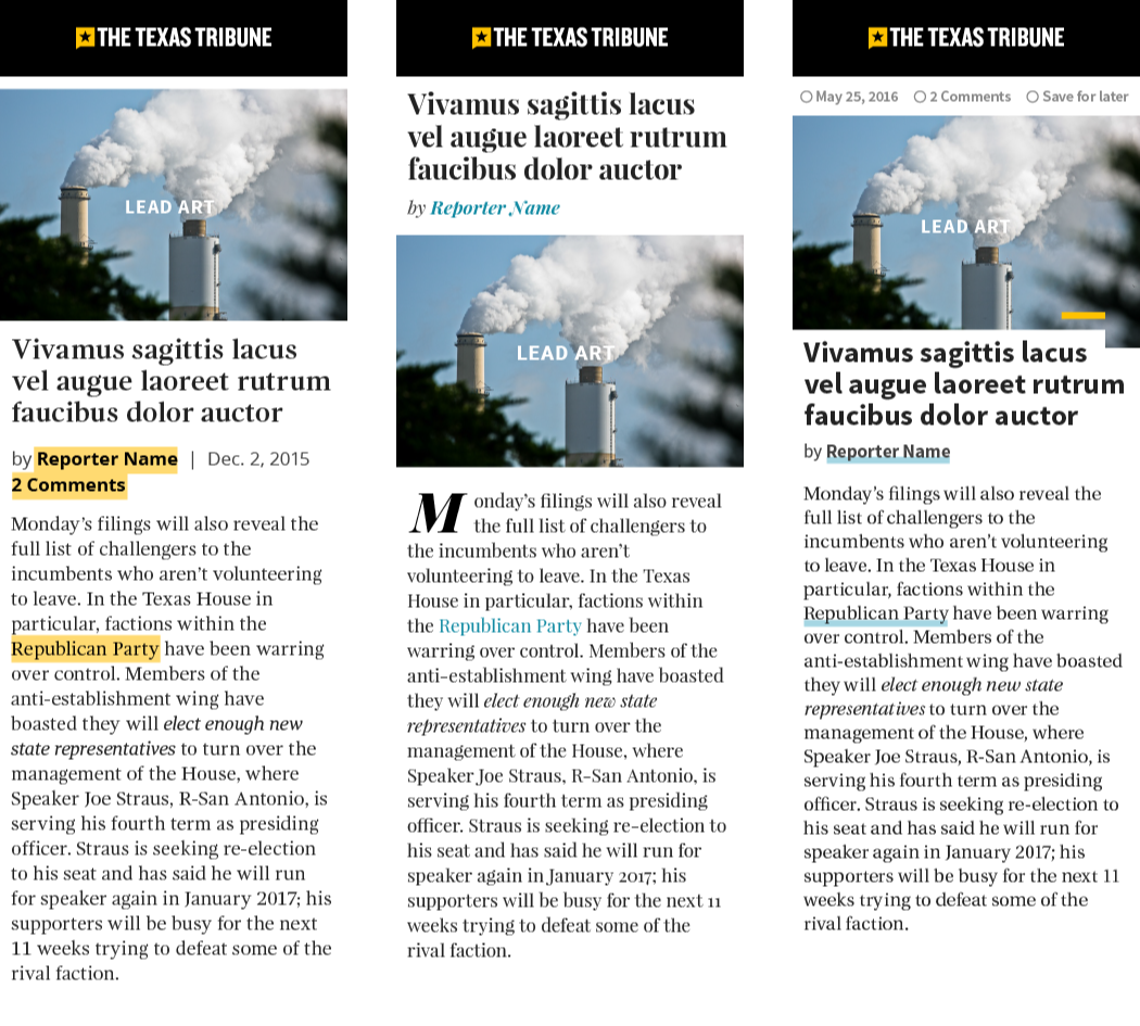
While many stakeholders were eager to see a new homepage design, we moved our attention to story pages—where we actually wanted and knew readers would spend the most time.
Adopting a ‘mobile first’ approach, I created several prototypes, exploring different style directions, while testing our various new color and typographic choices.

Structure & Foundation
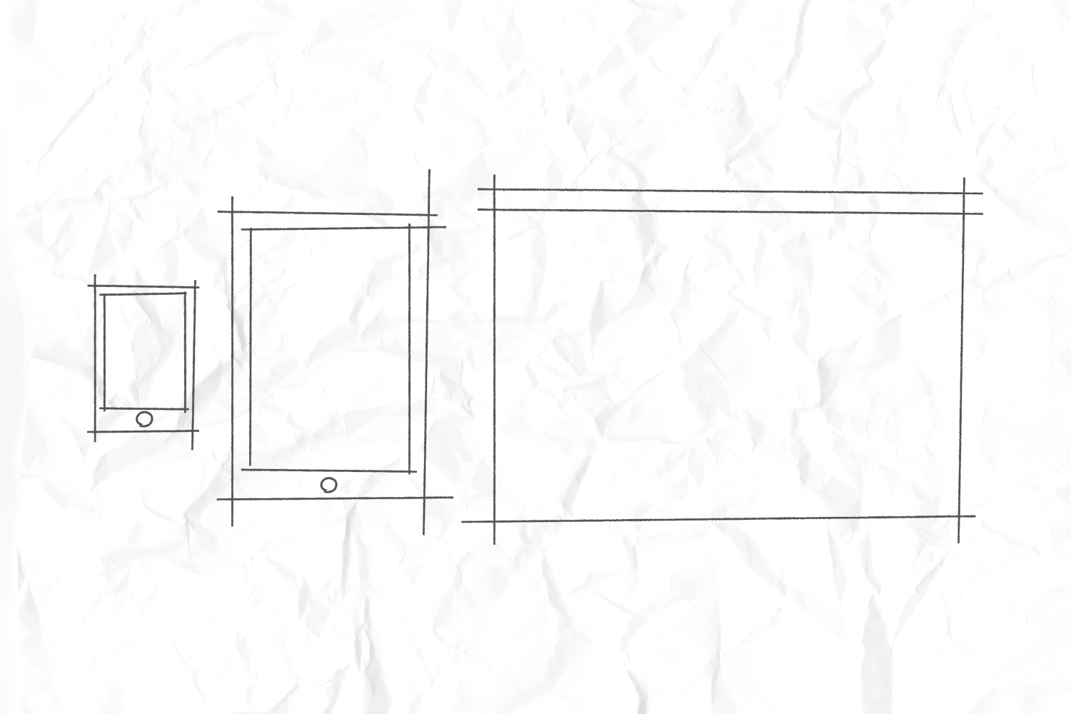
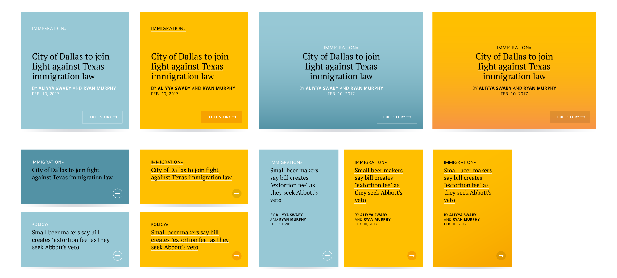
With my developers prepping for updates, it became clear that we needed to sync up on the underlying framework before implementing anything new. Together, we restructured the story page into modular components, creating three distinct layouts. This approach led to an optimized page length and improved ad slot integration, balancing the number of ads readers encountered per section against the amount of story text. This, in turn, enhanced ad tracking accuracy, guided readers to more relevant stories, and boosted engagement and ad revenue.
We also addressed key global elements, making tweaks to the site architecture and navigation, which gave us a clear priority roadmap. Part of our goal was to give readers access to content more quickly without excessive scrolling.
To achieve this, we simplified the navigation UI for both mobile and desktop, clearly distinguishing the site’s separate regions, each serving a specific purpose.
Ultimately this led to removing ‘breaking,’ ‘trending,’ or ‘latest’ news type links from the main navigation. However, in a later iteration, these collections would reappear in the form of a new secondary navigation below the homepage masthead. This update gave editors more moment-to-moment control over the homepage and allowed readers to easily find time-sensitive stories.
With these new structures in place, I moved on to creating story page mockups and began establishing a solid foundation of reusable styles.


From Mockups to Code
Our goal was to quickly turn these mockups into live, in-browser code for testing and comparison. By focusing on performance and accessibility from the outset, we set the foundation for a faster website. We then ran A/B tests and gathered feedback from peers and stakeholders to fine-tune our design directions.
Based on this input, I refined the mockups, which the developers then translated into live code. We kept iterating in this way—when I wasn’t creating new mockups, I was collaborating closely with the developers, providing notes (above) and feedback to ensure any designs were accurately reflected in the browser.

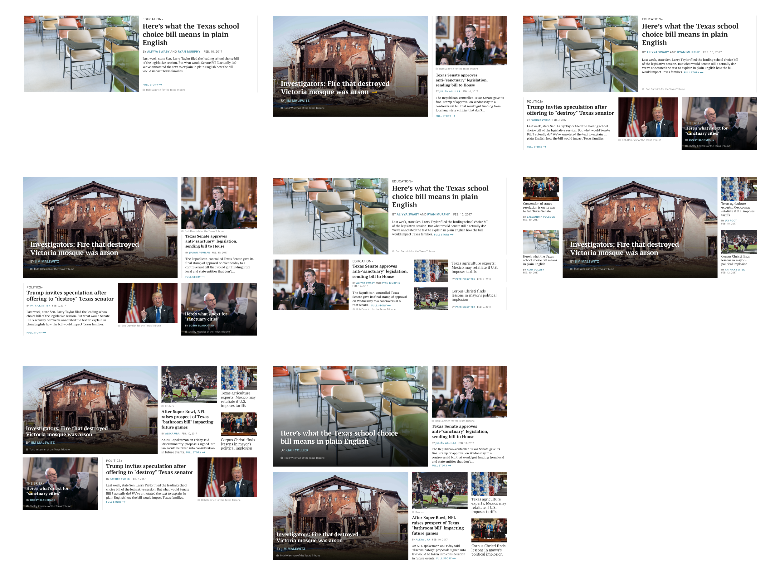
Homepage Lift
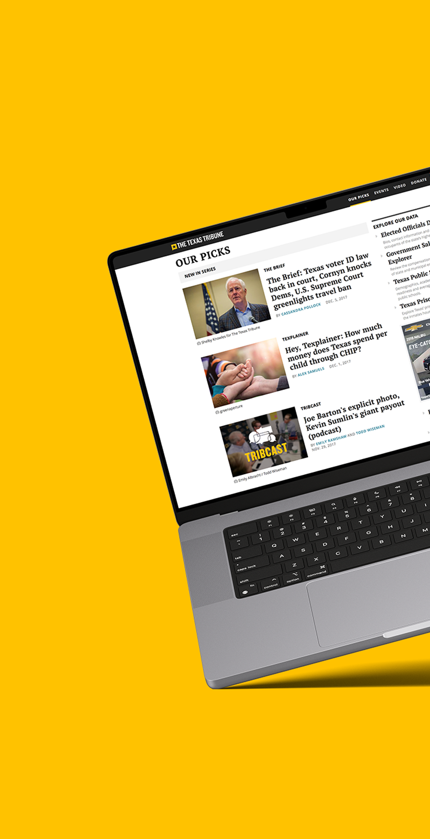
As the story pages neared completion, I began adapting our designs for desktop, using the existing structure and styles. I applied this process to the rest of the website, including the homepage. Throughout, I explored multiple design directions, encouraging feedback and discovery (above).
What didn’t work for one module often became the solution for another, creating a style feedback loop. Each new design incorporated the best elements from previous iterations, gradually shaping a clearer vision and a consistent visual language.

Based on reader feedback, we optimized our newsletters for print
Post Launch
We continued refining the site well after the initial launch, making improvements both on the front and back end. On the front end, we tackled the common issue of jumpy page loads by implementing pre-loaded ad slots, ensuring a smoother reading experience. With these in place, bloated ads wouldn’t affect page height after the story text rendered. I also designed a fallback image for these ad slots that doubled as a Tribune membership CTA.
On the back end, the Tribune’s aging CMS—a custom-built, open-source platform—was slowing down reporters with various fussy interactions and missing features.
I overhauled the UI and, together with the developers, added much requested features like a bulk image uploader. This allowed reporters to write and publish stories faster, with more flexibility and control over their presentation—a win-win for both journalists and readers.
After so many years, I'm proud to still see my contributions embedded in the foundation of the current Texas Tribune website, supporting the essential work they provide to all Texans.
Credits
Created at The Texas Tribune
Product & Project Managed by Becca Aaronson
Creative Direction by Jacob Villanueva
Engineering by Liam Andrew, Ty Brockhoeft, Andrew Gibson, Ashley Hebler